


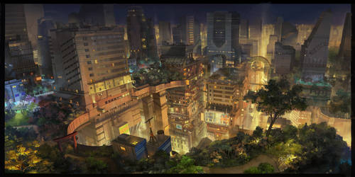
Small-Ho-Tall-Boots
GutGots
kitawnya
Sacritsune
LenamoArt
Georgiy88
Evyiione
yiimisekiz
nasedo-karnak
tylercherubael
Shadowlush
caezars
molybdenumgp03
DrawfestNZ
AssClownFish
Simanion
Tomiokajiro
nikosette
Angelikasan
AlicjaRodzik
KayPikeFashion
AdamHughes
efira-japan
PetitPlat
HamletMachine
ikenai
el-woopo
Collection
Favourites


Deviation Spotlight


- June 6
- Deviant for 18 years
- frogbitter.blogspot.com/
Badges

Update on me
0 min read
I got into animation school, pretty nervous.
I'm going to be learning 3D, I hope that goes well! So I guess yeah, 3D stuff will be on here sometime early next year most probably. Don't worry, I will still be drawing as much... in fact, probably a lot more. I feel inspired again!
Join the community to add your comment. Already a deviant? Log In
I'm stuck in a box!
0 min read
I am not completely content with my username. It seems absurdly girly now that I think about it. Maybe I just need to view it in a different way. Still.. I was never THAT girly.
Anyway..
Is it just me do the constraints of the rectangle in which have to exhibit our art distract away from the art itself? In my drawings, they look so full and overflowing when on paper in a space, but here surrounded by greyness, I feel some of that meaning is lost..
I could make it so that my pictures have a transparent background and thus in a way, look like they have spawned across the top of this grey-green page, but the thumbnails look absolutely awful.
Join the community to add your comment. Already a deviant? Log In
Profile Comments 231
Join the community to add your comment. Already a deviant? Log In
You are so incredibly awesome
Happy Birthday >u< Have some awesome times with your family and friends <3
AMY! Yay I found you! It's Inari btw ^.^
love your art!
Haha, thanks!
do you do any art trades?
I am not very reliable with internet related things, so you'd have to actually live near me XD
View all replies